Flutter in Action: Practical Guide to Building a LinkedIn Clone
- Yulian Airapetov
- Mar 18
- 7 min read

In the previous article, we explored why Flutter is an excellent choice for cross-platform development. We discussed its business benefits: reducing time and costs, a single codebase for all platforms, and highly adaptive UI. However, we only briefly mentioned our LinkedIn clone, without diving into the implementation details.
In this article, we’re taking it a step further and showcasing Flutter in action! We’ll go through the code, demonstrate its advantages in practice, and build a fully functional cross-platform application that works seamlessly on both web and mobile.
Ready to see how Flutter truly accelerates development? Let’s get started! 🚀

Understanding the Structure
Before jumping into the code, let’s briefly recap our approach. In the previous article, we analyzed the LinkedIn design, identified common UI components, and outlined how Flutter’s shared codebase can be leveraged to build an efficient cross-platform application. This preparation allows us to reuse UI elements while ensuring a native experience on both web and mobile.


Our UI consists of three main sections:
Post Feed – The main feed structure remains nearly identical, with slight modifications in user interactions (e.g., like, comment, and share buttons may be arranged differently).
App Bar & Bottom Navigation – On web, the app bar contains navigation options, while on mobile, these elements are repositioned into a bottom navigation bar for better accessibility.
User Profile Block – The profile section is consistent across both platforms and can be reused with minimal adjustments.
Now, it's time to put this into practice!
Let's move on to writing the code!
First, we'll create models for User and Post, which will serve as the foundation for our feed structure. These models will help us maintain a clean and structured data flow, making it easier to manage and display user-generated content across both web and mobile platforms.
class User {
  final String name;
  final int followersCount;
  final String imageUrl;
  final String job;
  final String location;

  User(this.name, t his.followersCount, this.imageUrl, this.job, this.location,);
} | import 'user.dart';
class Post {
final String text;
final String? mediaUrl;
final int repostsCount;
final int likesCount;
final String time;
final User user;
Post(
this.text,
this.mediaUrl,
this.repostsCount,
this.likesCount,
this.time,
this.user,
);
} |
These models contain fields that will be displayed in our UI, ensuring a structured representation of user and post data.
Flutter provides several ways to determine the current platform, allowing us to adapt the design and behaviour of our application accordingly. One of the most common methods is using the Platform class from dart:io, but this only works for mobile and desktop platforms. For web support, we can use kIsWeb from flutter/foundation.dart. Additionally, Theme.of(context).platform and defaultTargetPlatform provide platform information directly within UI components.
In our project, we will create an inherited widget called PlatformProvider, which will allow us to determine the platform type easily via context and adjust the UI accordingly:
class PlatformProvider extends InheritedWidget {
  final bool isMobile;

  const PlatformProvider({
    super.key,
    required this.isMobile,
    required super.child,
  });

  static PlatformProvider? of(BuildContext context) {
    return context.dependOnInheritedWidgetOfExactType<PlatformProvider>();
  }

  @override
  bool updateShouldNotify(covariant PlatformProvider oldWidget) {
    return oldWidget.isMobile != isMobile;
  }
}
Next, we'll wrap our MaterialApp with the PlatformProvider. This will allow us to determine the current platform and adapt our UI accordingly. By doing so, we ensure that platform-specific modifications are easily accessible throughout the app via the widget tree.
final bool isMobile = !kIsWeb;
  @override
  Widget build(BuildContext context) {
    return PlatformProvider(
    	isMobile: isMobile,
    	child: Container(
        	color: Colors.white,
          	child: SafeArea(
            	child: MaterialApp(
              		theme: basicTheme,
              		debugShowCheckedModeBanner: false,
              		home: isMobile ? const HomeView() :
							  		const HomeWebView(),
            	),
    		),
    	),
    );
  }
For the web version, we not only need to create components that will later be reused in the mobile layout but also implement a responsive design that adapts to different screen sizes.
Since we are replicating LinkedIn pixel-perfect, we’ll use the browser’s inspector to analyze UI changes when resizing the window and record key width breakpoints.
To achieve highly accurate responsiveness, we will break down the UI into key components and use conditional logic along with dynamic constraints in Container widgets. This approach ensures that our layout adjusts smoothly while maintaining a consistent design across devices.
Row(
	crossAxisAlignment: CrossAxisAlignment.start,
    mainAxisAlignment: MainAxisAlignment.center,
    children: [
    	if (width >= 767) ...[
        	ProfileBlock(maxWidth: 225),
            const SizedBox(
         	   width: 20,
            ),
         ],
        if (width < 767)
        	Expanded(
            	child: Column(
                		children: [
                     	ProfileBlock(
              	           minWidth: 485,
                           maxWidth: 576,
                         ),
                         PostsBlock(
                            maxWidth: width > 1200 ? 555 : (width < 990 ? (width < 767 ? 576 : 471) : 397),
                            minWidth: width < 767 ? 485 : 0.0,
                         ),
                     ],
                 ),
             ),
         if (width >= 767)
         	PostsBlock(
             	maxWidth: width > 1200 ? 555 : (width < 990 ? (width < 767 ? 576 : 471) : 397),
                 minWidth: width < 767 ? 485 : 0.0,
             ),
         if (width > 990) ...[
         	const SizedBox(
    	         width: 20,
            ),
            const GamesAndFeedBlock(),
         ]
    ],
),
I won’t be detailing every component; instead, I'll focus on highlighting the implementation of the common elements mentioned earlier. These shared components form the backbone of our UI and ensure a unified, responsive experience across both web and mobile platforms.
By emphasizing these key building blocks, we can showcase how Flutter's adaptive design capabilities allow us to maintain consistency and precision, even when scaling the UI to different screen sizes.
In the PostsBlock, depending on the platform, will be displayed different sequences of elements:
isMobile ?
	SliverMainAxisGroup(
   		slivers: [
        	SliverList(
            	delegate: SliverChildBuilderDelegate(
                		(context, index) {
                    		return PostView(
                      		constraints: constraints,
                      		post: posts[index],
                    		);
                  	},
                  childCount: posts.length,
                ),
              ),
            ],
          )
        :
	Column(
    	children: [
        	CreatePostView(
            	user: user,
                constraints: constraints,
            ),
            FilterView(
            	constraints: constraints,
            ),
            ...posts.map(
            	(e) => PostView(
                		post: e,
                  	constraints: constraints,
                ),
            ),
        ],
    );
Additionally, we need to adjust the button label positioning. On the web, the icon and text are arranged horizontally, while on mobile, they are stacked vertically for better touch accessibility.
To achieve this, we’ll add a simple platform check inside our ActionButton component. This will allow us to dynamically switch between a Row for web and a Column for mobile, ensuring a consistent yet platform-optimized user experience:
TextButton(
style: TextButton.styleFrom(
padding: padding ?? EdgeInsets.symmetric(horizontal: 8, vertical: isMobile? 8.0 : 20.0),
),
onPressed: (){},
child: isMobile?
Column(
mainAxisSize: MainAxisSize.min,
children: [
icon,
if(title != null) ...[
const SizedBox(width: 8,),
Text(title!, style: textStyle),
],
],
) : Row(
children: [
icon,
if(title != null) ...[
const SizedBox(width: 8,),
Text(title!, style: textStyle),
],
],
)
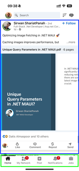
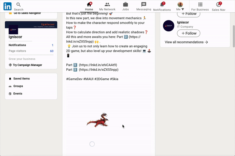
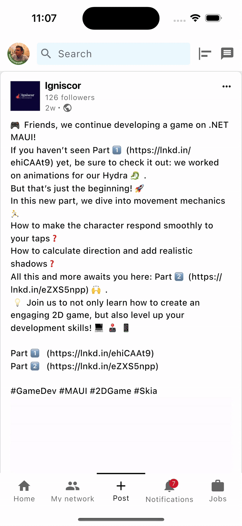
);The result can be seen in the screenshots below, showcasing how the design adapts seamlessly across both web and mobile platforms:


This widget example demonstrates how Flutter enables the creation and reuse of components across multiple platforms, ensuring consistent functionality and design on both web and mobile applications.
Next, we move on to creating the ProfileBlock. We will also split it into two separate widgets. For the web version, the user's avatar should be displayed over the background, while for mobile, there is no background, and the block is located within the drawer.
Column(
	mainAxisSize: MainAxisSize.min,
	crossAxisAlignment: CrossAxisAlignment.start,
	children: [
		Stack(
          clipBehavior: Clip.none,
          children: [
            Image.asset(
              "assets/images/profile_banner.png",
              fit: BoxFit.fitWidth,
              height: 58,
              width: double.infinity,
            ),
            Positioned(
              top: 34,
              left: 16,
              child: CircleAvatar(
                radius: 36,
                backgroundColor: Colors.white,
                child: ProfileImage(
                  imageUrl: user.imageUrl,
                ),
              ),
            ),
          ],
        ),
        Padding(
          padding: const EdgeInsets.fromLTRB(16, 50, 16, 16),
          child: UserInfoView(user: user),
        ),
      ],
);
As you can see, the main UI widgets in this component are ProfileImage and UserInfoView. Let's take a look at the ProfileView for mobile:
return Column(
	mainAxisSize: MainAxisSize.min,
	crossAxisAlignment: CrossAxisAlignment.start,
	spacing: 10,
	children: [
		ProfileImage(imageUrl: user.imageUrl),
		UserInfoView(user: user),
	],
);
Here is the result we achieved:


Thanks to proper decomposition, we can reuse the same UI components for the mobile layout, showcasing one of the major advantages of Flutter — its ability to maintain consistency and efficiency across platforms.
We have one last element to adapt for reuse — the AppTabBar. Although the button sequence differs between the web and mobile versions, both share identical click animations and button structures. To ensure consistency, we'll first implement the underline animation in a shared widget, enabling easy adaptation across platforms:
LayoutBuilder(
	builder: (context, constraints) {
		final width = constraints.maxWidth;
		final buttonWidth = (width - (isMobile ? 0 : 8)) / (isMobile ? 5 : 8);
		return Stack(
			children: [
				AnimatedPositioned(
					duration: const Duration(milliseconds: 200),
					left: selectedTab * buttonWidth + (selectedTab > 5 ? 8 : 0),
					child: Container(
						width: buttonWidth,
						height: 2,
						color: Colors.black,
					),
				),
			],
		);
	},
),
Next, depending on the platform, a specific sequence of tabs will be shown. Despite the difference in tab order, all tabs are rendered using a single NavigationButton component, ensuring a consistent structure across both web and mobile:
Stack(
	alignment: Alignment.center,
	children: [
		navigationItem.imageIcon == null?
		Icon(isSelected && navigationItem.alternativeIcon != null?
			navigationItem.alternativeIcon : navigationItem.icon,)
		: ProfileImage(
			imageUrl: navigationItem.imageIcon ?? '',
			radius: 11,
		),
		if (navigationItem.badge != null)
			Align(
				alignment: Alignment.center,
				child: navigationItem.badge ?? const SizedBox.shrink(),
			),
	],
),
The result of our efforts:


One of the key tools for cross-platform development in Flutter is the use of conditional imports. This feature allows importing different libraries or using different implementations depending on the platform the app is running on. This helps optimize code, add platform-specific functionality without duplication, and maintain a unified codebase. As a result, performance and flexibility are enhanced, tailoring the app precisely to the needs of each platform.
In our case, we choose which layout to load based on the platform, and this helps avoid loading unnecessary resources. By using conditional imports, we can ensure that only the relevant resources for each platform are loaded, optimizing performance and reducing the overall app size. This approach allows us to tailor the user experience for both mobile and web without sacrificing efficiency.
import 'presentation/utility/stubs/home_view_stub.dart'
if (dart.library.io) 'presentation/mobile/views/home/home_view.dart'
if (dart.library.html) 'presentation/web/views/home/home_web_view.dart';
And here’s the final result of our application: a fully responsive LinkedIn clone that seamlessly adapts to both web and mobile platforms.
Conclusion and Perspectives
Through this practical guide we've demonstrated Flutter in action, building a LinkedIn clone that runs seamlessly on both web and mobile. Through a shared codebase, we minimized development time and costs while maintaining a native experience across platforms.
This implementation demonstrates how Flutter simplifies UI consistency, adaptive design, and efficient state management without compromising performance. Whether you’re building a business application, a social platform, or any other multi-platform project, Flutter proves to be a powerful and cost-effective solution.
Ready to take your project to the next level? Our team specializes in Flutter development—let’s discuss how we can bring your idea to life! Contact Us.
The full code from this article will be here 📂.


ความคิดเห็น